New Kildare stadium seat colour raises questions
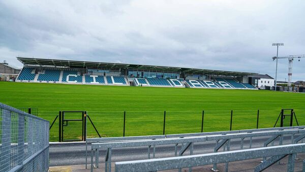
The redevelopment work at St Conleths Park is nearing the end Photo: James Lawlor
THE worldwide knowledge web can take you down some quare rabbit holes. Not least on a wet long weekend when club fixtures in Kildare, and consequently the Hound of Hawkfield, are taking a breather before the madness commences next weekend.
It was the video put out by Kildare GAA that triggered my latest search for knowledge. Of course, when I saw it pop up on my “timeline” I was convinced the waiting was over. A manager appointment finally? Sadly not. No Brian Flanagans in sight.
No, it was a film of the “coming soon” new St Conleth’s Park that came out on Friday and it quickly had me thinking about county crests and colours.
It was the seats of the new stand that triggered me. It doesn’t take much.
It’s probably a small matter in the scheme of the things, and the bigger issue is how you get little more than a cricket pavilion for €17m these days (yes, I know that figure included floodlights, a new pitch and a few other tweaks).
But never mind the fact there’s a maximum of 3,000 of them, what on earth is going on with the seat colours?
I can understand that white may not be the most practical option (at least some are used to spell out “Cill Dara”) but I had to take a double take at the alternating light blue and navy (?) colours that seemed to be jumping out at me.
Was I looking at a redeveloped Parnell Park I wondered? Have the Dubs finally spent a few quid on a decent training ground?
Apparently my light blue is “teal” to some other eyes. And it’s green to others still. My eyes see it as something akin to sky blue. What is teal anyway I wondered to myself and wondering usually leads to googling, as you know.
Apparently the first recorded reference to the colour was in the early 1900’s and the name originates from the European teal bird, which had a greenish-blue stripe on its head. Technically it seems to be a mixture of cyan, rather than dark blue, and green, but we’ve already gone deeper than planned here.
I have no idea why teal would be a colour associated with Kildare. It doesn’t seem to feature in the crest which is a darkish blue and a darkish green.
That current Kildare GAA crest originated in 2005 and reflected the desire of the GAA to create a copyrighted version to prevent third parties from benefitting commercially from official endeavours.
“This gives us something definite, a new image for our brand which hopefully will make it easier to fundraise through our merchandise,” said Kildare PRO Alan Bell at the time.
It was described as “taking the shape of a St Brigid’s cross with the outline of a large ball and a much smaller ball.” So far so fair.
If she was around today perhaps Brigid would take an injunction against the use of her cross but that’s not what I’m here to talk about. My question is about the colours of said cross.
Indeed, why is the Kildare crest navy and green at all, I asked myself? And when myself had no answer, the research had to go deeper.
To little avail, it has to be said. We all know the Kildare playing colours are predominantly white in honour of the initial county champions Clane who togged out in flourbags back in the day we’re told.
The idea of counties having a change strip is relatively recent, although there are records for Cork, for example, creating a one-off black jersey in 1920. It carried the images of Tomás Mac Curtain and Terence McSwiney, two Mayors of Cork who died in the War of Independence.
Generally, though, for a long time, if there was a clash of colours, teams would change into their provincial jersey. I still have the horrors from watching Kildare getting battered by Monaghan in Croke Park when sporting the green of Leinster during the 1980’s.
If you asked anyone however in that decade or Micko’s era that followed, what was the second colour of the Lilywhites, the unanimous answer would have been black, surely?
When jerseys began to acquire the embellishment of “trims”, Kildare’s were invariably black, as were (and still are) the numbers. Who could forget indeed the chequered flags on Hill 16 during the ‘90s?
But neither that Monaghan shellacking nor the more intuitive merits of black persuaded the powers-that-be that anything other than green should become our official change jersey colour when “away” shirts became a thing.
Green at least has some historical link when you look at the county crest of Kildare, featuring as it does both a St Brigid’s cross and an oak tree featuring that colour.
A green snake also featured in the Kildare GAA crest, which in itself was a link to that of Kildare County Council, which in turn was based on the crest of the county town of Naas. Indeed, the motto of Naas in Latin is “Prudens ut Serpens” meaning “Wise as a Serpent.” That logo lasted until 1991 when the original “Kildare Supporters Club”, believing the snake to be a bad omen, requested the County Board to make a change. Never mind the arrival of management royalty in O’Dwyer, perhaps ridding Kildare of the snake was the trigger for the successes of that decade?
The new version with acorns and lilies and plenty of greenery lasted until the arrival of the current, modern-looking cross fourteen years later.
But where did blue come from? It not only features in the logo but became for a few years the new change jersey colour, though that has since given way to black.
Answers on a postcard please, or if you insist on modern communication mechanisms, via email to the sports editor.
Cill Dara Abú